Portfolio
Microcopy revisions
This post is an exercise in revising text on a website. I picked an existing website to indicate the things I look for when reviewing microcopy, rather than how I approach a first draft.
The following images are from the website for the Baskin School of Engineering at the University of California, Santa Cruz. Overall, the website looks good. There isn’t much text, instead using plenty of visuals to engage the audience. The home page is meant to welcome and excite users, so the large font and images are appropriate. However, it does take quite a bit of scrolling to reach the next block of information due to the size, so many users may not even reach the Overview section below the first block.
Looking through the text, I notice a couple places where some revisions could be made. The first is in the section with links to social media, recent news, and upcoming events.
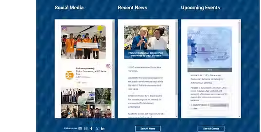
There’s some inconsistency across the page with capitalization. Some text, like the headers and buttons in this section, are in title case, while the message “Follow us on” is in sentence case, and most of the other headers on the page are in sentence case. Sentence case is easiest to read and more simple to follow, so I would switch all of these labels to sentence case.
The icons after “Follow us on” do not have any tooltip or indication of what they go to, unless you read and understand the URL that shows on hover. A tooltip or label would help users understand where they’re going when they click the icon. In this case, the icons are logos of companies, and tooltips would be especially helpful when companies change their logos, as users may not be familiar with the new icon.
There’s also some inconsistency in whether buttons are verb phrases or noun phrases. “See All News” in this section is a verb phrase, while the button in the next section “Climate solutions at Baskin Engineering” is a noun phrase. In this case, since these buttons don’t start workflows, and instead function more as links, I would remove the verb and make all such buttons noun phrases.

Normally, a block of text like in the second section would not be engaging to users. However, this is the home page of an informational site, so users are likely looking for this kind of information. Users are given progressive disclosure with the link to more details after the summary paragraph, keeping the page simple but informative.
This review doesn’t cover everything, but is meant to show what I look for in text on websites and applications. Overall, writing for the user experience is about getting the right information to users at the right time in an easily digestible way. This is my goal whenever I review text.